PROJECT SUMMARY
This is a great space to write long text about your company and your services. You can use this space to go into a little more detail about your company. Talk about your team and what services you provide. Tell your visitors the story of how you came up with the idea for your business and what makes you different from your competitors. Make your company stand out and show your visitors who you are.
Tip: Add your own image by double clicking the image and clicking Change Image.
The owner, Kim Moody, reached out to me about helping her brand out her child care business after I bugged her for a year about it...loll! Persistence pays off!
Colorful, approachable, fun and easily recognizable was the way she wanted to position her brand. We tried a few approaches initially with treasure chests with kids in it and treasure maps but they didn't quite fit, she felt they were a little to busy.
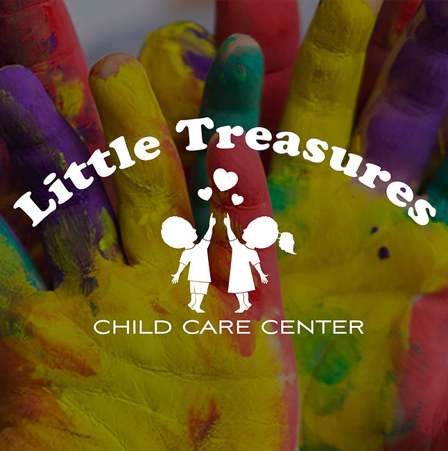
So, back to the drawing board where we choose the silhouettes of the boy and girl reaching for the hearts along with a simple typeface in an arc. We played around with the colors until satisfied. The client was very happy with the mark and was ready to get it out into the world!
For the website, we wanted to replicate the colorful, easy feel from the logo. So we kept the page count low and navigations simple. Kept the CTA front and center, so that families can easily call for a tour and get more info. Also, the daycare was in a historical building in Norristown, so we added a sub-page with info about that.
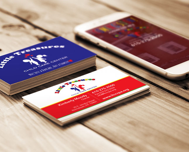
Lastly, the business cards and stationary rounded out the offering.